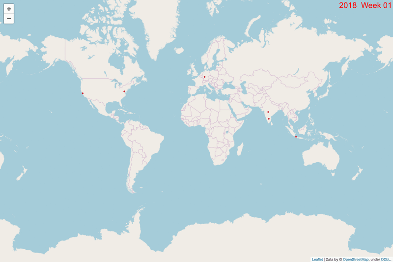
DoS attacks visualized over time
- Date: Aug 2019
- Idea/Intention: A router half-way around the word seems to complain about lots of DoS attack. Investigate where these are originating from. Find the pattern. Block bad guys.
- Sourced Data from: Logs sent to Email.
- Technology Stack:
- Python script to pull data from mail and then parse.
- ImageMagick to convert the manipulate the images and make a gif
- Challenges: What's the best way to show the data.
- Outcome: Got a csv with data - can slice that further. Charted to images by each week - doing Days was not as digestable.
- Next steps: Slice the data to notice other patterns. Specific times from certain IPs. Heatmaps over time.