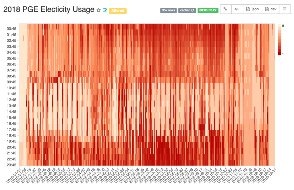
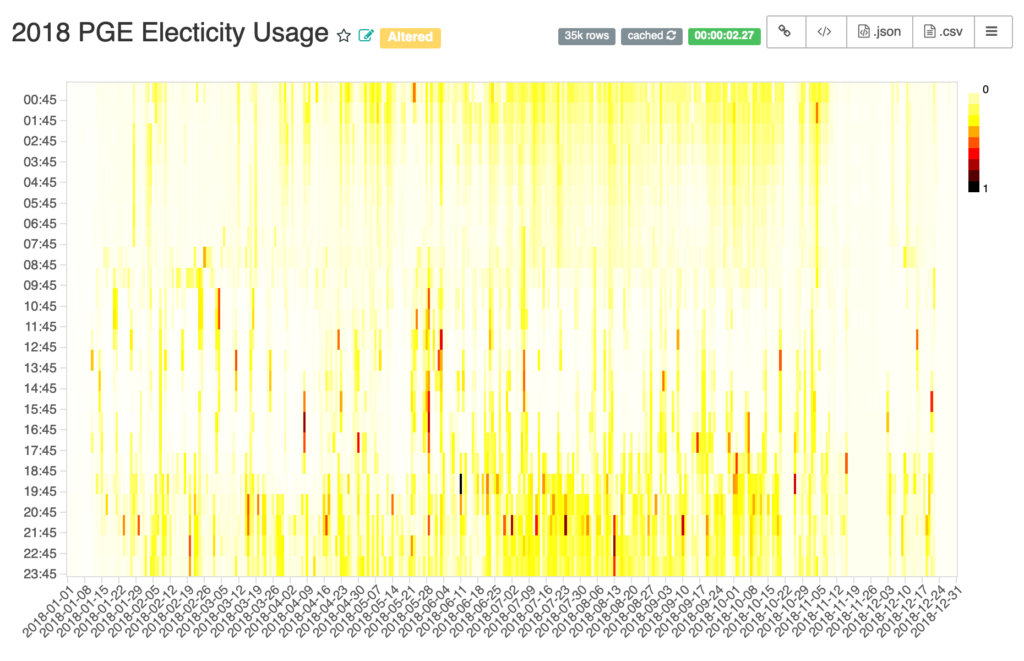
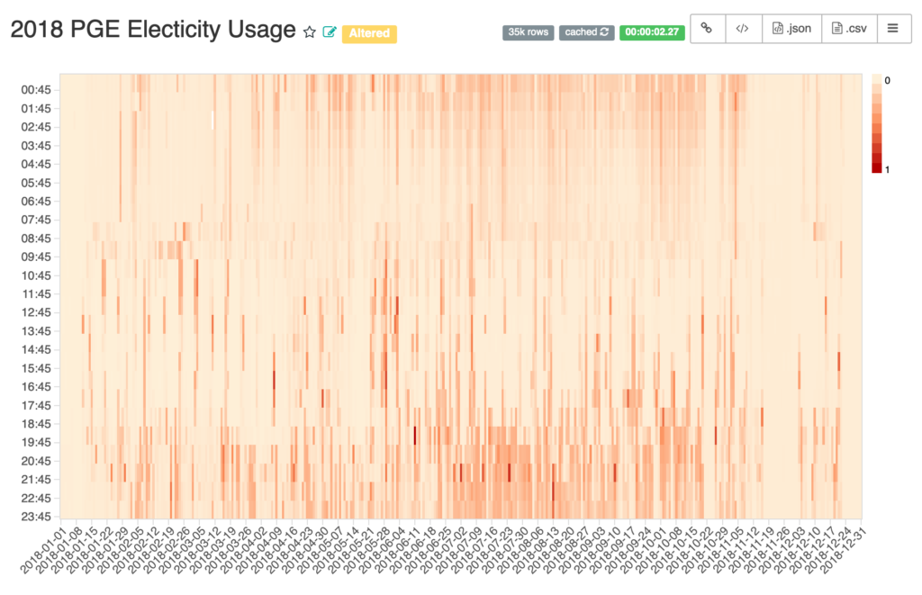
How a color can make a difference.
- Date: Sept 2019
- Idea/Intention: When do I use the most electricity? Any simple things I can do to reduce my carbon footprint?
- Sourced Data from: PGE website. Downloaded data as a csv.
- Technology stack: Uploaded csv to Superset and messed with its viz. Superset is selfhosted on my Docker host.
- Challenges:
- Setting up Superset. (Finding the right docker-compose.yml)
- Importing the csv data in Superset. (Got an error that required a update and redeploy)
- Picking the right color for the heatmap. See the 3 different variations below. Each seem to teall
- Outcome: Got a heatmap.
- Next steps:
- Zero usage should be white.
- Plot by month, week and day. Any different patterns noticed?
- The Viz: