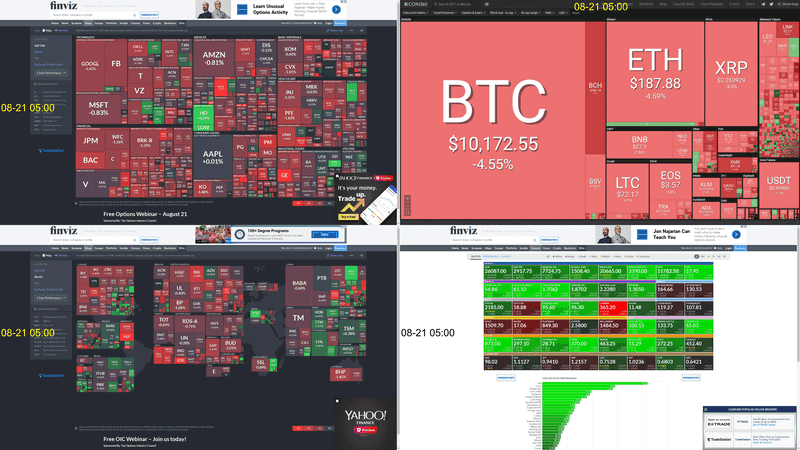
Market changes animated over a month
Animations may be cool, but if not done right, they can be confusing.
- Date: August 2019
- Idea/Intention: See markets change over time.
- Sourced Data from: FinViz
- Technology stack:
- Python + Cron
- Imagemagick
- Challenges:
- (minor) Adding text to the images and stiching them to make a 2x2
- Outcome: An animated gif of the markets. Still hard to say what's really going on.
- Next steps: Unsure.
- The Viz:
One page. One snapshot in time.
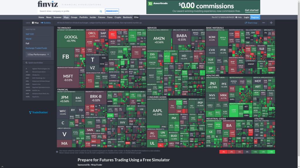
What all the markets look like from mid-Aug to Sept
- 4 date synchronized time-lapses. WTF is going on here?